- Using Google Sheets or Excel, you can build a dividend tracking spreadsheet that provides insight into income, yields, and growth.
- Pivot tables allow you to create a dividend tracking spreadsheet that is dynamic and can be easily updated as new data is added.
- Though other dividend tracking tools exist, spreadsheets allow you to display data and charts in a custom format.
- Get the insights you need to make smart decisions regarding your investments and your dividend income.
CREATE AN AMAZING STOCK PORTFOLIO SPREADSHEET (EXCEL)
Save time – download a copy of the Dividend Spreadsheet here!
Don’t feel like DIY-ing it? I don’t blame you. It’s a lot of work.
Complete the form below and click Submit.
A link to the Google Sheet will be emailed to you.
Once you’re in the spreadsheet, click on File > Make a copy to edit. I’ll no longer be responding to “Requests for access.”
How to make a dividend tracking spreadsheet template in Excel & Google Sheets
As with all of my spreadsheet-based posts, I’ll be using Google Sheets. The same results can be accomplished with Excel. However, since the pivot table interface is a little different, you won’t be able to follow along exactly with Excel.
There are many different ways to look at dividends. I tried to keep it somewhat simple by focusing on what I thought was the most fundamental information.
Some of the other dividend tracking spreadsheets out there focus on the present – what is the dividend amount/yield right now. That’s fine and good. But I wanted to make something that provided context.
Many will also use the GOOGLEFINANCE function in Google Sheets. This can be useful. In fact, I relied heavily upon it in my Stock Portfolio Spreadsheet. But, that function only provides current dividend yield information. Not much else dividend-related.
An investment’s current dividend yield is good to know. But, more important is your dividend yield. The amount of income you’re earning relative to your initial investment. Knowing this and knowing how fast your dividend is growing will help you determine if you’re reaching your dividend investing goals.
Finally, I’ll warn you up-front. This dividend tracking spreadsheet will require you to make manual entries initially and on an ongoing basis. There are ways, I imagine to connect to an API or scrape the web for the information you need. But, those are only options for people who are really technically savvy. Plus, they can be unreliable. Ultimately, I don’t think you’ll find that the manual updates are too much of a chore.
IMPORTANT! Make sure you read the entire post all the way through. I know it’s long… Because it’s long, I didn’t want to retype the same processes over and over in detail. So, if you come to something you think I’ve glossed over – check to see if it was covered earlier in the post.
HOW DO I CALCULATE DIVIDENDS IN EXCEL? YIELD, GROWTH, PAYOUT, INCOME
Step 1 – Investment data
First of all, go ahead and open up a brand new Google Sheet. Name it Dividend Tracking Spreadsheet or something else descriptive.
If you need help navigating Google Drive/Sheets check our my Stock Portfolio Spreadsheet post. It’ll walk you through the process.
So…you’ve got to purchase a dividend-paying investment before you’ll get paid a dividend. Therefore, we’ll start out by renaming our empty worksheet Investment Data.
Now, in cells A1:F1, enter the following headers:
- Sym-Date
- Symbol
- Name
- Purchase Date
- Shares
- Purchase Price
Most of these fields should be pretty self-explanatory. This information lays the foundation for dividend yield calculations.
HOW DO YOU KEEP TRACK OF DIVIDENDS? 24 UNIQUE OPTIONS
Making a unique identifier for each investment
What’s this Sym-Date field about? This field serves as an index. It provides a unique “key” for each Investment Data row. This key lets us pull this information into another worksheet. It also happens to be the only one on this worksheet with a formula.
The formula we’ll enter into cell A2 (and copy down from there) is as follows:
=IF(ISBLANK(B2),””,B2&”-“&TEXT(D2,”MM/DD/YYYY”))
What this formula does is look at the Symbol field first. If it’s blank, then the Sym-Date field will remain blank too. If the Symbol field has something in it, then this formula will combine the Symbol and the Purchase Date (in a MM/DD/YYY format).
Copy this formula down for as many rows as you think you’ll need. Remember, you can always copy it further in the future too. Then enter the Symbol, Name, Purchase Date, Shares, and Purchase Price for all of your current dividend-paying positions.
I also like to gray out or color cells with formulas in them. This makes it easy for me (and others) to know which cells should be modified and which cells can accept information (the white ones). If you like, you can do the same on this worksheet and the others we’ll create.
This worksheet is done and should look something like this:

Step 2 – Dividend data
This worksheet is the foundation for the rest of the workbook. It is here that you’ll enter every dividend payment you’ve received for the investments you entered on the Investment Data worksheet.
Here are the headers to enter across row 1. Cells A1:I1.
- Sym-Date
- Symbol
- Name
- Purchase Date
- Shares
- Purchase Price
- Cost Basis
- Dividend Date
- Dividend Amount
“But, most of those fields were entered on the Investment Data worksheet?!?” you might be saying to yourself.
True. And, it seems redundant, maybe. But actually, the reason for creating the Investment Data worksheet was to avoid redundancy. Hopefully, how it does that will be made clear shortly.
Data validation between Investment & Dividend Data worksheets
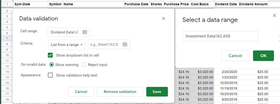
As mentioned earlier, the Sym-Date field serves as a key that links the Investment Data worksheet and the Dividend Data worksheet. In order for this key to work, we need to make sure that there is an exact match between each worksheet. We do that by utilizing a feature called “Data validation.”
Select cells A2:A600 (or however long you think your list needs to be). Then select “Data > Data validation” from the menu. The Data validation options will then come up. From here, the most important option is the Criteria. You want to make sure it says “List from a range” and that the “Show dropdown list in cell” checkbox is selected. Then, in the box to the right of “List from a range,” click on the little grid and select cells A2 through the end of your Sym-Date formulas on the Investment Data worksheet. Similarly, you can just type in something like this:
‘Investment Data’!A2:A50
Make sure to select the “Reject input” radio button and click “Save.”
Now, each cell in column A will have a little dropdown arrow that allows you to select a Sym-Date value from the Investment Data worksheet.
We’ll use the Sym-Date field as an anchor to pull Investment Data into this worksheet. We want the spreadsheet to look for that unique value and then to list the Symbol, Name, Purchase Date, Shares, and Purchase Price.
Bringing the Investment Data information in
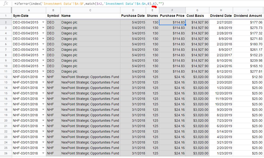
To do that, we’ll use a combination of a couple of different formulas. In cell B2 type the following:
=IFERROR(INDEX(‘Investment Data’!$A:$F,MATCH($A2,’Investment Data’!$A:$A,0),2),””)
Without the ISERROR function, the formula would return an error if the Sym-Date is blank. Beyond that, this formula is looking for that particular Sym-Date on the Investment Data worksheet and displays the corresponding Symbol. Symbol is in the 2nd column (the “2” toward the end of the formula) of the A:F range – keep that in mind.
Copy that formula down to the bottom of the worksheet. Then, for every Sym-Date you select from the dropdown menu, the Symbol from the Investment Data worksheet should populate.
From there, copy the contents of cell B2 over to the right, underneath the Name, Purchase Date, Shares, and Purchase Price headings. After you do that, you should still see the Symbol populating in those cells. In order to get the info you need, you’ll have to change the “2” in each formula to the corresponding column.
Those corresponding columns and formulas are as follows:
| Column/Field | Formula |
|---|---|
| Name | =IFERROR(INDEX(‘Investment Data’!$A:$F,MATCH($A2,’Investment Data’!$A:$A,0),3),””) |
| Purchase Date | =IFERROR(INDEX(‘Investment Data’!$A:$F,MATCH($A2,’Investment Data’!$A:$A,0),4),””) |
| Shares | =IFERROR(INDEX(‘Investment Data’!$A:$F,MATCH($A2,’Investment Data’!$A:$A,0),5),””) |
| Purchase | =IFERROR(INDEX(‘Investment Data’!$A:$F,MATCH($A2,’Investment Data’!$A:$A,0),6),””) |
Once, you have the appropriate data in the appropriate columns, you can copy the formulas down to the bottom of the spreadsheets.
One more formula for Dividend Data
Cost Basis is equal to Purchase Price × Shares. But, in order for our pivot tables to spit out accurate info, we need to make sure that this formula shows a blank for rows with no data in them. In order to do that, type this formula into cell G2:
=IF(E2*F2=0,””,E2*F2)
This formula says if Purchase Price × Shares is blank (e.g. a product of 0), then just leave the cell blank. If both fields are populated, go ahead and multiply them
Copy that down to the bottom of your spreadsheet.
The manually entered Dividend Data information
The final two fields on this worksheet have to be filled in by you. For every dividend, you’ve received (and want to track), enter the Date and Amount.
It’s important to note that you should enter the total Dividend Amount received. For instance, if you owned 100 Shares of a company that paid a $1 per share dividend – you should enter $100.00 as the Dividend Amount, not $1.
This information is probably best retrieved from your brokerage’s website. In fact, you can probably copy + paste it without too much trouble. If for some reason it’s not available from your brokerage, then you can use a site like this.
Here’s how the Dividend Data worksheet should look if you’ve been able to follow along:
Step 3 – Previous year’s Dividends & Yields
Before we get into it, here’s an idea of what you’re working toward. The finished product:

Thus far, we’ve laid the groundwork for the dividend tracking spreadsheet. Now it’s time to put together some robust reporting that will easily update when you add Investment Data and Dividend Data in the future.
As I’ve said before, we’re going to rely on the power of pivot tables for this reporting. If you’re inexperienced with pivot tables, don’t get freaked out. I’ll continue to walk you through the process.
All pivot tables will be built off the Dividend Data worksheet. So, go to that worksheet and click on column A and then hold the mouse button and drag across to column I. All nine columns with data in them should be selected. Let go of the mouse button.
With these columns selected, go to the menu and select “Data > Pivot table.” The Data range should read as follows:
‘Dividend Data’!A:I
Make sure the “New sheet” radio button is selected too, then click “Create.”
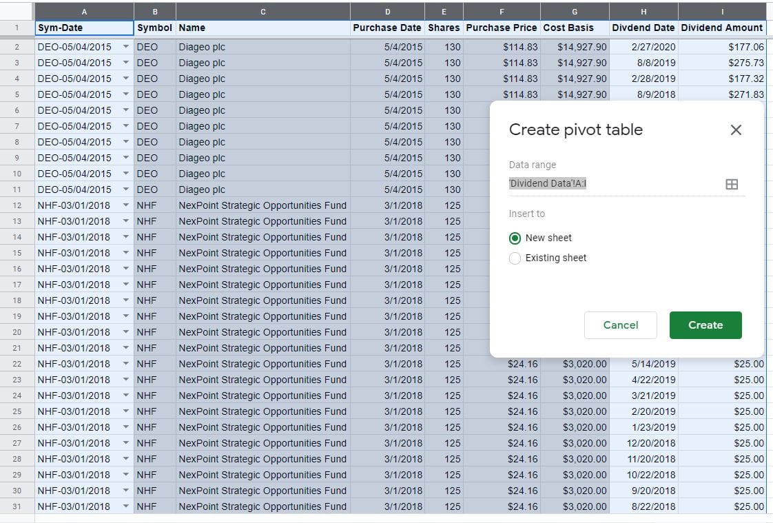
A new worksheet named Pivot Table [#] should have been created with the words Rows, Columns, and Values in some of the cells. Also, keep the Pivot table editor open on the right side of the screen.
Previous Year Dividends & Yields pivot table setup
First things first, let’s change the name of the worksheet to something more descriptive. Double-click on the tab that says Pivot Table [#] and change that to Prev Year Dividends/Yield, or something similar.
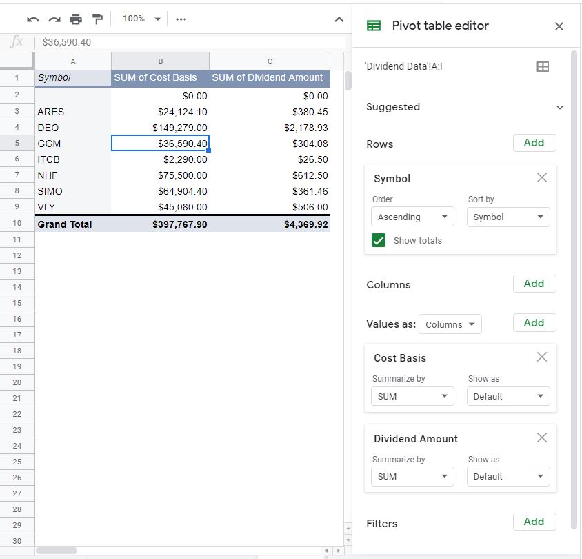
In the Pivot table editor, click on the “Add” button beside the word Rows. You’ll notice that every field we highlighted on the Dividend Data worksheet is available as an option. Select Symbol.
Boom. You should see all of your Symbols populate on the pivot table.
For this pivot table, we’re going to remove the Grand Total too. So uncheck “Show totals” in the Symbol box in the Pivot table editor.
Next, let’s click on the “Add” button next to the “Values” option in the Pivot table editor. Select Cost Basis and Dividend Amount.
By the way, if your Pivot table editor is missing, just click on one of the cells inside the pivot table, and it should reappear.
After adding those Values, you’ll see information populated in the pivot table. But, it’s a far cry from what we’re looking for. So, we’re going to have to tweak it a bit.
Previous Year Dividends & Yields pivot table details
First, we’ll want to change the name of the SUM of Cost Basis column to just Cost Basis. Also, change SUM of Dividend Amount to Prev Year Dividend. You should be able to do this by typing over cells B1 and C1 respectively.
Then, in the Pivot table editor, you want to change the “Summarize by” for Cost Basis to “AVERAGE” from “SUM.” Since the Cost Basis is the same for every row in the Dividend Data worksheet, an average will provide us with the actual Cost Basis.
Dividend Amount should remain “SUM.”
Since there is no Prev Year Yield field in the Dividend Data worksheet, we’re going to include it in the pivot table by creating a calculated field. This is done by clicking the “Add” button (by “Values”) and selecting “Calculated Field.” Calculated Field should show up in your pivot table and in the Pivot table editor.
“=0” should show as the default Formula. Overwrite that with the following:
=SUM(‘Dividend Amount’)/AVERAGE(‘Cost Basis’)
This formula takes the total Dividend Amounts (subject to the Filter we’ll enter next) and divides that by the “average” Cost Basis. Remember, since all Cost Basis should be the same, it’s just the Cost Basis.
Also, change Summarize by to “Custom” and change cell D1 to read Prev Year Yield.
Okay, we’re getting close…
Now it’s time to put in some filters to get the exact data we’re looking for.
First, we want to get rid of the blank Symbols. Click “Add” by Filters in the Pivot table editor. Select Symbol. Then click the dropdown below Status. Click on “(Blanks)” to uncheck it. Then “OK.”
Now, we will only have actual Symbols showing up in the pivot table.
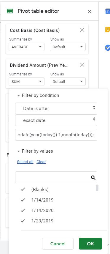
The next Filter is going to take another formula. This is a formula for the Dividend Date. Though that field isn’t included in the pivot table we can still filter by it. This filter is what will restrict the data retrieved so that we only see Dividends (and Yields) that took place over the past year.
Click “Add” (by Filters) and select Dividend Date. Then, click on the Status dropdown and select “Filter by condition > Date is after”. Below that, you’ll see a new dropdown with the word “today” in it. Click on that and select “exact date.” Now, you’ll see a text box below that where you can enter a Value or formula. Finally…enter the following formula in the text box:
=DATE(YEAR(TODAY())-1,MONTH(TODAY()),DAY(TODAY())+1)
This formula generates a date that is a year ago, tomorrow.
E.g. if today is 04/27/20, then it will return 04/28/19. This means that every Dividend Amount received during that period will be included in the pivot table.
Let’s give this Calculated Field a more appropriate name too. Something like Prev Year Yield. Type that into cell D1.
That’s a lot of steps for one filter. So here’s a glance at what you should be seeing:
Almost done with this particular pivot table.
In order to make room for our custom totals, let’s move the pivot table down two rows and one column to the right. That can be done by highlighting rows 1 & 2, right-clicking on the highlighted rows, and selecting “Insert 2 above.” If you highlight column A and right-click, you can select “Insert 1 left” and a new column will appear.
Next, I would suggest that you highlight column E (Prev Year Yield) and change it to “Format as percent.” You can do that by clicking on the little “%” icon on the toolbar. This ensures that your Prev Year Yield reflects as 3.03%, for example, rather than .03033179483.
Previous Year Dividends & Yields pivot table totals
Now, we want to add some totals so that we can summarize your dividend portfolio as a whole.
Yes, some of these totals will be the same as those that were calculated when the “Show totals” checkbox was checked for Symbol in the Pivot table editor. Prev Year Dividend, for example. But, not every column will automatically total as we want it to (Prev Year Yield). So, we will enter them manually. Doing so allows us to put the totals at the top of the pivot table too. Which, I think, is more convenient.
The first total will go in cell C2. Here, we want a simple sum of every Cost Basis. So, enter the following formula there:
=SUM(C4:C53)
If you feel you might have more than 50 Symbols in the foreseeable future, you can change C53 to whatever you want.
The same thing will be done for Prev Year Dividend. Enter the following formula in cell D2:
=SUM(D4:D53)
In order to summarize Prev Year Yield, we don’t want to sum the Prev Year Yield for each Symbol. That won’t be useful or accurate. Rather we simply want to divide the total Prev Year Dividend by the total Cost Basis. To do so, enter this formula in cell E2:
=D2/C2
Now, as new information is added to the pivot table, our totals will automatically be updated.
Here’s a reminder of what each total is telling us:
| Cost Basis | Prev Year Dividend | Prev Year Yield |
|---|---|---|
| SUM of all Cost Basis | SUM of all Prev Year Dividend | Prev Year Dividend ÷ Cost Basis |
Previous Year Dividends & Yields chart
All that’s left for this pivot table is to add some illustration of the data with a chart.
What you want to chart is a personal preference. For me, the most important piece of information from this pivot table is a breakdown of how much each Symbol is contributing to my total Prev Year Dividend. So, a pie chart seems like the appropriate style to use.
Highlight all of your Symbols and highlight all of the values in the Prev year Dividend column (not the total). Then, from the menu, click “Insert > Chart.” You’ll probably see a Column chart by default. The Chart editor should have popped up where the Pivot table editor was too.
In the Chart editor, make sure you’re in the Setup section and select “Pie chart” from the Chart type dropdown menu.
The chart and its settings should look something like this:
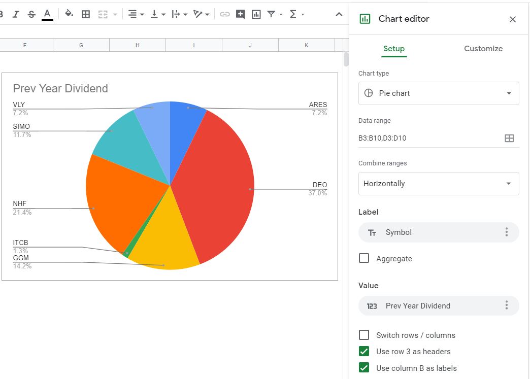
That’s basically it for the Prev Year Dividends/Yield worksheet! You’re, of course, welcome to customize as you see fit. But, the foundation is laid.
What can we learn from the Previous Year’s Dividends & Yields worksheet?
Why look at dividends from only the past year?
Well, because it’s the most recent period that catches all the effects of seasonality. Plus, as a matter of convention, income is often measured annually.
With the formula we entered above, we’re capturing the amount of dividends received over the past 365 days. It’s a rolling report – that is as long as you update the Dividend Data worksheet. If you don’t do that, the report won’t be useful!
Anyhow, we want to know the absolute (Dollar) amount of the past year’s dividends. That’s good to know. With that information, we can break it down into quarterly, monthly, weekly amounts – whatever frequency we desire.
Dividend Amounts don’t tell the entire story, however. A share of stock that pays you $1 a year, but only costs you $1 is probably a very good investment. You probably wish that you bought a lot more of it. Like $100K or $1 million. Whatever you could afford.
Conversely, a share of stock that pays you a $1 dividend every year, but costs $500 isn’t all that great. You’re risking $500 per share for a measly $1 per year.
Yes, this example is simplistic. There might be capital gains or other considerations. But, this is a dividend tracking spreadsheet. So, I’m assuming your main concern is dividend income. Whether that income is spent or reinvested is inconsequential.
So…that’s why we measure Prev Year Yield. Because what matters is what you risked for this investment and what it’s paying you.
Not what you would risk if you bought it today.
Not what it paid you five years ago, or what it will pay you five years from now.
What matters is how much money you have tied up in these investments and what have they done for you lately?
That’s why we bring in Cost Basis and Prev Year Dividend. So we can answer this question.
Step 4 – Total Dividends & Yield
“What have you done for me lately?” is one of the most important questions to ask your investments. But, in order to see the whole picture, we also want to know about every dividend paid.
With this next pivot table, Total Dividends/Yield, we’ll look beyond a year into the past. We’ll look at the entire history of your investments.
Remember, details covered in the previous step won’t be repeated – for the sake of brevity. So, if I walk through something here and don’t explain it, see if it was covered in detail above.
Anyhow, first things first, here’s what we’re working toward:
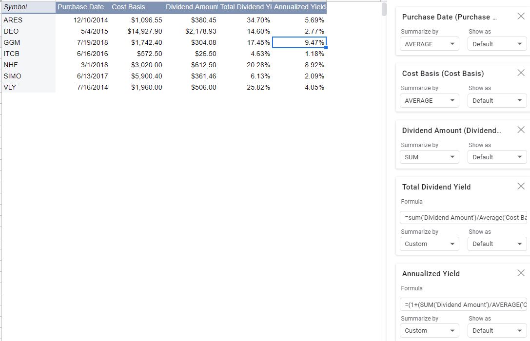
Total Dividends & Yields pivot table setup and details
First, you’ll need to highlight columns A:I again on the Dividend Data worksheet and create a pivot table on a new worksheet.
Change the name of the worksheet to Total Dividends/Yield.
Again, add Symbol for the Rows. Uncheck “Show totals” and add a Filter for Symbols so that you can remove (Blanks).
The first Value to add is Purchase Date. This wasn’t added on the Prev Year Dividends/Yield worksheet. By default, Purchase Date is going to want to Summarize by “COUNTA.” Change that to “AVERAGE.” Again, since the Purchase Date is imported from the Investment Data worksheet, it will be the same for each Sym-Date. So, calculating the average of the Purchase Date will just give us the actual Purchase Date.
Change cell B1 to read Purchase Date too.
Next, add an “AVERAGE” of the Cost Basis and “SUM” of the Dividend Amount just as you did in the Prev Year Dividends/Yield worksheet. Rename those to Cost Basis and Total Dividends respectively too (cells C1 and D1).
Okay, now for a couple of Calculated Fields.
Add the first Calculated Field and drop the following Formula in there:
=SUM(‘Dividend Amount’)/AVERAGE(‘Cost Basis’)
You might notice that this is the same formula we used for the Prev Year Yield in the Prev Year Dividends/Yield worksheet. It’s the same principle, except this time we’re not going to Filter the Dividend Date because we want to look at Total Dividends, not just those paid over the last year.
Name this Calculated Field Total Dividend Yield (cell E1) and change the Summarize by dropdown to “Custom.” You can now also “Format as percent” column E if you like.
Finally, add one more Calculated Field. Drop this Formula in there:
=(1+(SUM(‘Dividend Amount’)/AVERAGE(‘Cost Basis’)))^(1/(YEARFRAC(AVERAGE(‘Purchase Date’),TODAY())))-1
Yikes. That’s a beast. What’s this formula do?
First of all, the SUM and AVERAGE functions are only there because this is a pivot table Formula. In an ordinary worksheet, those wouldn’t be needed.
Beyond that, this formula calculates what your compound (Annualized) Yield is between your Purchase Date and today. More on this below.
Just as before, name this Calculated Field Annualized Yield (cell F1) and change the Summarize by dropdown to “Custom.” You can now also “Format as percent” column F too.
We’ve moved through this step a lot quicker than the previous one. What you see in your pivot table should look something like this:
There we go. The foundation is laid. Let’s add some totals. Some of these totals are going to be simple. Others, a little more complex.
Total Dividends & Yields pivot table setup and details
Insert two rows (1, 2) above the pivot table and one to the left (A).
The first total, for Purchase Date is one of the complex ones. “How do you total a date?” you might be asking. Well, we’re not totaling, we’re calculating a weighted average. Since days are recognized as numbers in spreadsheets, we can do just that.
“How are days numbers?” you might be asking now. Here’s how:
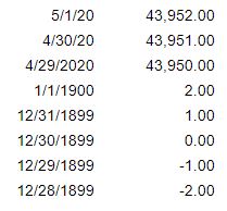
In Google Sheets, December 31, 1899, is also known as 1. January 1, 1900, is known as 2. December 30, 1899, is known as 0. The day I’m writing this, April 29, 2020, is known as 43,950. And so on…
Go ahead and try it for yourself in a spreadsheet. Input a date and change the format to “Number.”
So, since a date is a number, we can use it in calculations.
What are we weighing the Purchase Date with? In this case, the Cost Basis (the denominator in our Annualized Yield formula). This gives us one Purchase Date that accurately represents the entire dividend-paying portfolio.
In order to make that weighted average calculation of the Purchase Date enter this formula in cell C2:
=SUMPRODUCT(C4:C53,D4:D53)/D2
Don’t get freaked out when you see a #DIV/0! error. That will go away when we add our next total…
Remember that you can extend these totals to as many rows as you want. For this example, we’ll stop at row 53 (50 rows total).
The next few totals are simpler. Ones that we used on the Prev Year Dividends/Yield worksheet.
Both Cost Basis and Total Dividends totals will simply add up each of the respective dollar amounts.
Enter the following in cell D2, for the Cost Basis total:
=SUM(D4:D53)
Enter the following in cell E2, for the Dividend Amount total:
=SUM(E4:E53)
Again, change the ending row from 53 to suit your needs. Just make sure all of your totals refer to the same rows.
The total for Total Dividend Yield is also essentially the same as it was on the Prev Year Dividends/Yield worksheet.
Enter the following in cell F2:
=E2/D2
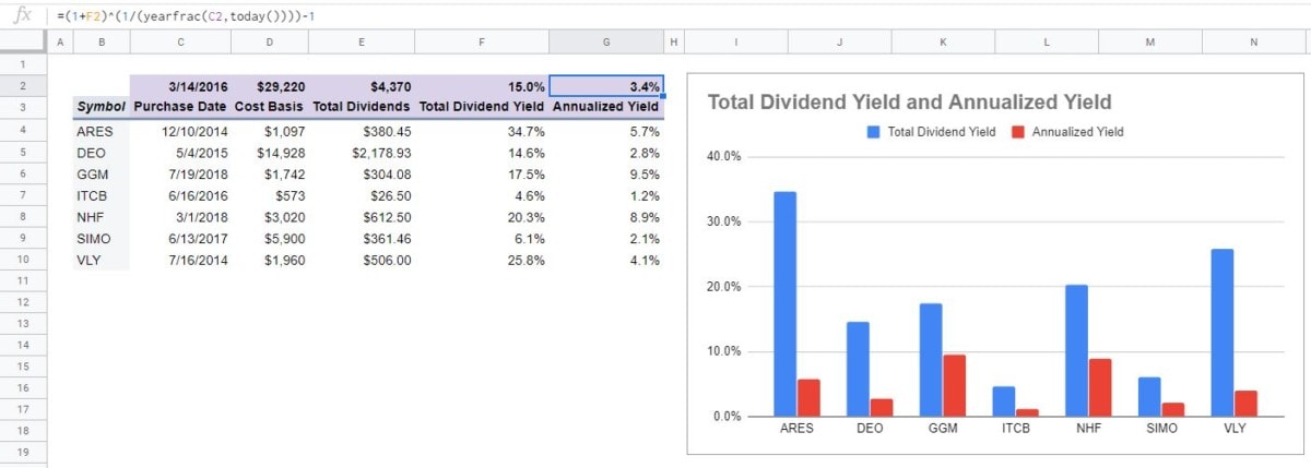
Our last total is, of course, for the Annualized Yield field. Since the other totals provide the information we need, we’ll be using the same basic formula we put into the Calculated Field earlier.
In cell G2, enter the following:
=(1+F2)^(1/(YEARFRAC(C2,TODAY())))-1
Remember, this complicated formula measures the compounded (Annualized) return you’ve realized from all your dividend-paying investments.
Here’s a summary of what each total measures:
| Purchase Date | Cost Basis | Total Dividends | Total Dividend Yield | Annualized Yield |
|---|---|---|---|---|
| Weighted average of all Purchase Dates | SUM of all Cost Basis | SUM of all Total Dividends | Total Dividends ÷ Cost Basis | Compounded yield between Purchase Date and TODAY |
Total Dividends & Yields pivot table chart
All the totals are in place – let’s add a chart for illustration.
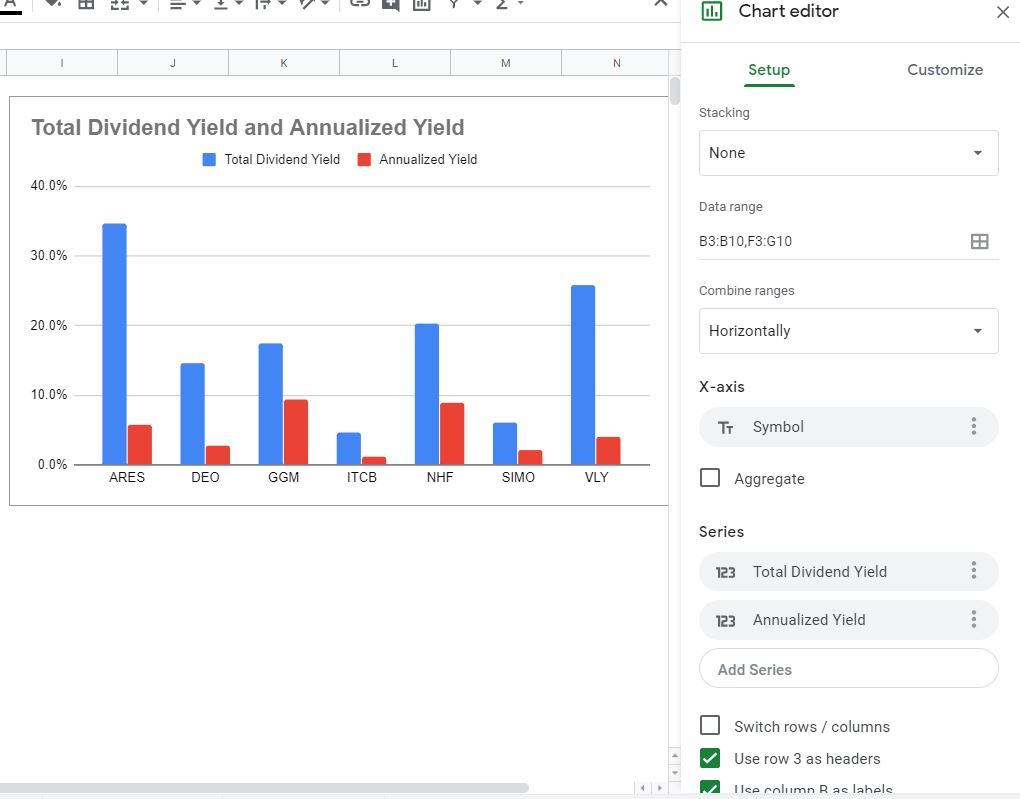
We could do another pie chart to show what percent of Total Dividends each Symbol represents (and you’re welcome to add that on your own). Rather, this time, we’ll make a column chart that compares Total Dividend Yield and Annualized Yield across Symbols.
To do that, highlight the Total Dividend Yield and Annualized Yield data and insert a chart. The chart will probably come out looking just about right. The only modifications I would suggest are to go to the Customize section of the Chart editor and add a Chart title (Chart & axis titles section). I’d also go to the Legend and select “None” in the Position dropdown.
Compare what you see on your Chart editor to this:
What can we learn from Total Dividends & Yields?
In essence, the same things we learned from looking at our previous years’ dividends and yields. But, over the life of our investments, not just over the past year.
Beyond that, though, there is one important distinction – the Annualized Yield.
As mentioned above, this is a measure of what your compounded annual yield is for each investment and in total.
Let’s go over a couple of thought experiments to (hopefully) illustrate the point.
First, imagine you own the following two investments. Which is better?
| Symbol | Total Dividend Yield |
|---|---|
| ABC | 50% |
| DEF | 20% |
Well, without any other information, we’d all agree that ABC is better. The Total Dividend Yield is higher.
But, what if we introduce the following information:
| Symbol | Total Dividend Yield | Purchase Date |
|---|---|---|
| ABC | 50% | [20 years ago] |
| DEF | 20% | [2 years ago] |
This tells a different story, doesn’t it? Getting 50% of your investment back via dividends over the course of 20 years is okay… But, getting 20% of your investment back over 2 short years has to be better, right? How much better, though?
| Symbol | Total Dividend Yield | Purchase Date | Annualized Yield |
|---|---|---|---|
| ABC | 50% | [20 years ago today] | 2.05% |
| DEF | 20% | [2 years ago today] | 9.54% |
About 4.5x better. As you can see, Annualized Yield factors in the effects of time and compounding on Yield. The higher the Total Dividend Yield and the more recent the Purchase Date the better the Annualized Yield will be and, all things being equal, the better investment you made.
“Wait, if the Total Dividend Yield is 20%, and the Purchase Date was two years ago, shouldn’t the Annualized Yield be 10%? Not 9.54%?”
That brings me to my second point. Keep in mind, the Annualized Yield is the compounded yield. It’s not just a matter of taking the Total Dividend Yield and dividing it by the number of years that have passed.
A 10% Annualized Yield would have resulted in a Total Dividend Yield of 21% (1.10 × 1.10 = 1.21) – a return of 10% compounded over two years.
Rather, what we had in this example was a return of 9.54% compounded over two years (1.0954 × 1.0954 = 1.20).
Hopefully that all makes some sense. In essence, what we’re measuring is the rate at which your money is “snowballing” over the time period you’ve owned it.
Step 5 – Dividend Growth
We’ve set up reporting for the past year of dividend income and for the entire history of dividend income. Both those worksheets looked to the past. And, so will this one. But, it will look to the past with an eye to the future.
No, past results aren’t indicative of future performance. You’ve heard that before and I believe it to be true. But looking at past dividend growth might give us an idea of what we can expect in the future. Especially when looked at in aggregate.
As with the previous worksheet, things covered previously won’t be covered again in great detail. If you feel I’ve glossed over something – check above.
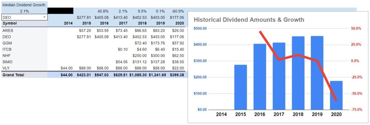
Here’s the finished product. This is what we’re building toward:
Dividend Growth pivot table setup and details
By now, hopefully, you know the drill. Create a pivot table from columns A:I in the Dividend Data worksheet.
Put it in a new sheet and name that sheet Dividend Growth.
Again, our Rows will display Symbols and we want to Filter out “(Blanks).”
This time we will not uncheck “Show totals” for Symbols (Rows). You’ll see why in a bit.
Go ahead and Add Dividend Amount to Values too. Don’t change the name in cell B1, though. Because we’re going to do something new here…
We’re going to add a field to the Columns section of the Pivot table editor. That field is Dividend Date.
Right away, you’ll notice the pivot table change. Every Dividend Date has its own column in the pivot table. That’s not really helpful, so we’re going to have to make some tweaks.
But, before we do that, uncheck the “Show totals” checkbox for the Dividend Date (Columns). We don’t need a Grand Total for the columns. Again, leave “Show totals” checked for Symbols (Rows).
What we want to do is group Dividend Amounts into years.
Some companies pay dividends monthly. A lot of them pay quarterly. Others might pay (semi) annually.
Grouping by years allows us to smooth out that seasonality.
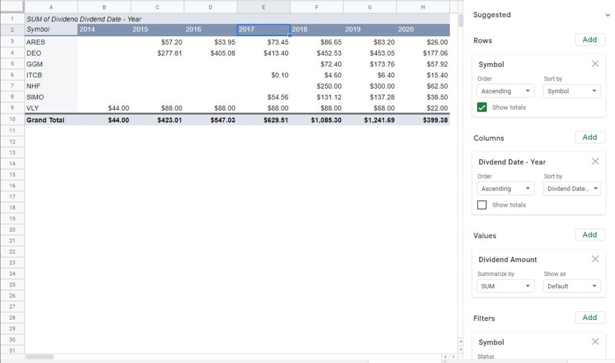
To group by years – right-click on any of the Dividend Dates displayed (on row 1). When you do this, you should see an option to “Create pivot date group.” Mouse over that and select “Years.”
Right away, you should notice that the number of columns in your pivot table shrinks, and each represents a whole year.
This, along with everything else we’ve done thus far, represents why I chose to use pivot tables for this dividend tracking spreadsheet. They’re very powerful, quick, and versatile. Once you’re comfortable with them, you can customize this dividend tracking spreadsheet to display whatever information you want.
Here’s, roughly, what your pivot table (and the editor) should look like now:
Dividend Growth pivot table totals
Go ahead and insert a column to the left and four rows above the pivot table. We’re going to need a little more room for the totals on this worksheet.
While we’re manipulating rows and columns, highlight row 5 now. It’s the one with SUM of Dividend Amount and Dividend Date – Year in it. Right-click on the highlighted row and select “Hide row.” This information isn’t adding anything to the worksheet, so we’ll hide it.
Remember how we used Data validation on the Dividend Data worksheet? We’re going to do that again.
Make sure your cursor is in cell B4. Select “Data > Data validation” from the menu. You want the Criteria to read “List from a range” and the range to be “‘Dividend Growth’!B7:B56”. Again, if you anticipate having more Symbols, you can change the ending row. Every other default in the Data validation box should be correct, and should read like this:
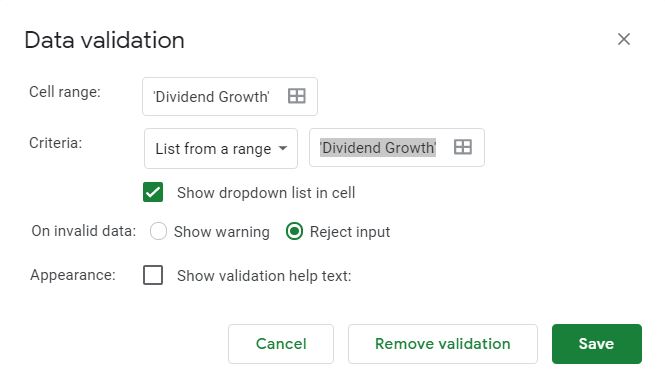
If that’s all okay click “Save.” There should now be a dropdown box in cell B4 that allows you to select any of your Symbols and Grand Total.
The next step is to bring in the total Dividend Amount for whatever Symbol we select in cell B4. Yes, this is redundant. The total Dividend Amounts are already listed in the pivot table.
So why display them again? Because it’s the most simplistic way to calculate the growth rate and to chart individual Symbols.
Bringing this information up from the pivot table requires another (somewhat) complicated formula. The premise is simple, but the functions might seem a bit puzzling. Type this formula into cell C4:
=INDEX($C$7:$Q$57,MATCH($B$4,$B$7:$B$56,0),1)
Then, copy + paste that formula across row 4, all the way to cell Q4.
However, it’s not until we make a small tweak to each formula, that’ll we’ll get accurate information. That tweak has to do with the “1” inside the last close parenthesis. This number represents how many columns to the right to look for information (in this case Dividend Amounts).
Here’s an idea of the corresponding columns and formulas:
| Column | Formula |
|---|---|
| C | =INDEX($C$7:$Q$57,MATCH($B$4,$B$7:$B$56,0),1) |
| D | =INDEX($C$7:$Q$57,MATCH($B$4,$B$7:$B$56,0),2) |
| … | … |
| P | =INDEX($C$7:$Q$57,MATCH($B$4,$B$7:$B$56,0),14) |
| Q | =INDEX($C$7:$Q$57,MATCH($B$4,$B$7:$B$56,0),15) |
When all of those formulas are tweaked, you should see 15 years of Dividend Amounts for any given Symbol.
As you can probably figure, this formula goes looking for the Symbol in cell B4, finds it in the pivot table, and displays the Dividend Amount for the year listed in row 6. If you choose a new Symbol from the dropdown in cell B4, you should see the amounts in row 4 change. And, they should match what you see for that Symbol down in the pivot table.
With the redundant information out of the way, let’s introduce some new information.
In cell D3, type the following formula:
=IF(ISBLANK(D4),””,IFERROR(D4/C4-1,””))
The purpose of this formula is to measure the growth in Dividend Amount between the year in row 6 and the previous year. The rest of the formula just ensures that an empty cell is displayed if there is an error (i.e. no Dividend Amount).
Copy that formula over to cell Q3 and change it to “Format as percent.”
This formula should copy just fine. It shouldn’t need any manual “tweaks.”
Maybe you’re wondering why there’s no formula in cell C3? That’s because this column will display the very first year from all of your Dividend Dates. So, there is no previous year to use for the measurement of dividend growth.
You might see some erratic growth percentages in row 3. Particularly in the second and latest year that dividends were received. This is because the first and last years probably only have partial year Dividend Amounts. You likely didn’t (haven’t) owned this investment for those entire years. So, you didn’t (haven’t) receive(d) a full year’s worth of dividends.
Because of this, we want to measure median dividend growth rather than average. Measuring the median will lessen the effects of the extreme high and low-growth years.
Therefore, in cell B2, we’ll type:
“Median Dividend Growth”
And, in cell B3, enter the following formula:
=MEDIAN(D3:Q3)
Here’s a reminder of our totals:
| MEDIAN Dividend Growth | Dividend Growth Year 2 | … | Dividend Growth Year 2 | Dividend Growth Year 2 | |
| Dividend Amount Year 1 | Dividend Amount Year 2 | … | Dividend Amount Year 14 | Dividend Amount Year 15 | |
| [Year 1] | [Year 2] | … | [Year 14] | [Year 15] |
Dividend Growth pivot table chart
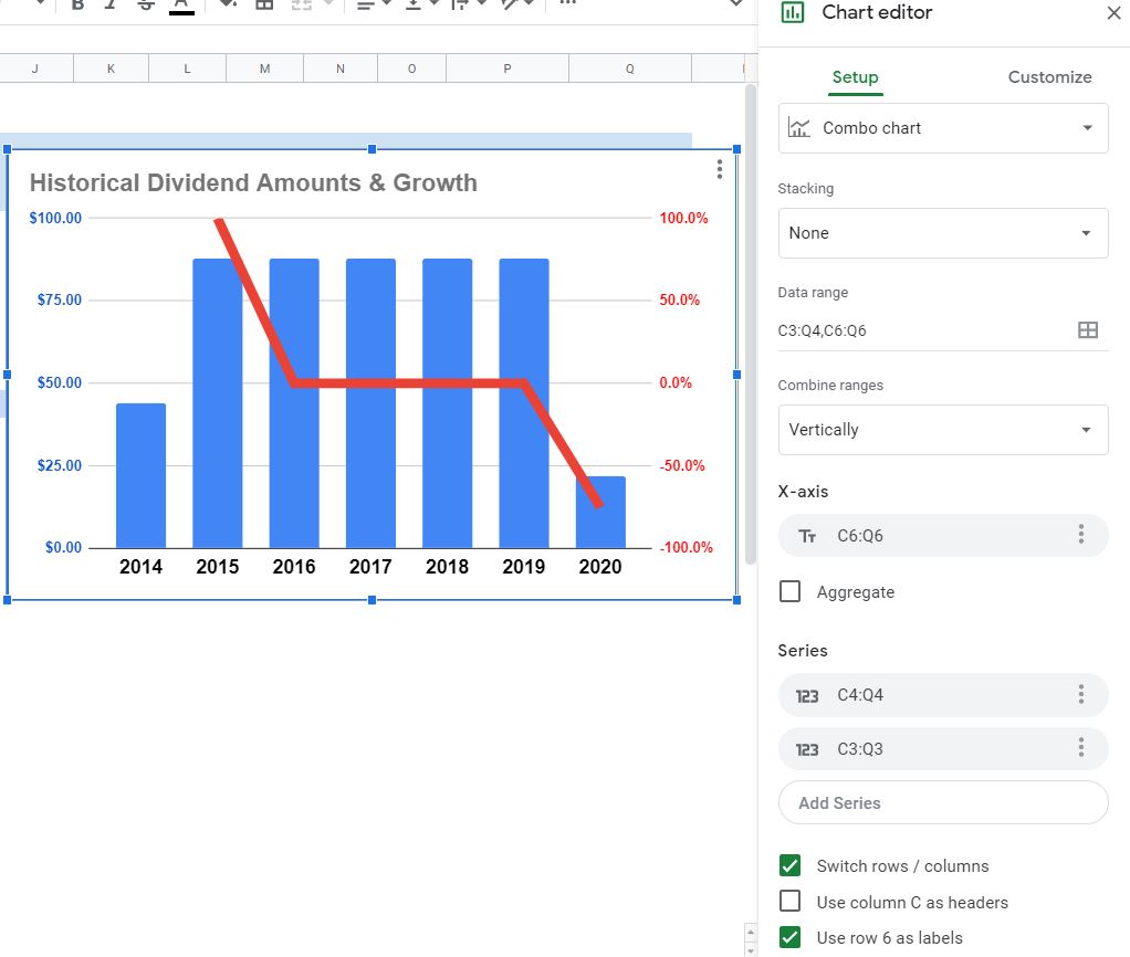
With all of the totals calculated, all that’s left is the creation of a dynamic chart that will change every time a new Symbol (or Grand Total) is selected from cell B4.
To create this chart, highlight cells C3:Q4, hold the Ctrl button, and also select cells C6:Q6. Remember, we’re skipping row 5 for the same reason we hid it – it has no pertinent information on it.
With those cells highlighted, create a new chart. Google Sheets will probably default to a “Column chart” with a bunch of colorful bars on it, but nothing else of use.
So, the first thing we want to do in the Chart editor is to change the Chart type to “Combo chart.” Since no text is displayed when you click on the Chart type dropdown, you might be wondering which one is the “Combo chart.” Look for this icon:
Unfortunately, that doesn’t solve all of our problems, though. There are a few more steps to getting this looking right.
Change the Combine ranges dropdown to “Vertically.
Then, go down to the bottom of the Chart editor and check the “Switch rows/columns” box.
Click in the Add X-axis field and choose “C6:Q6.” It might also read something else, like “2014.” Go ahead and select that if it does.
Then, if one of the Series has a Label below it, click the “x” on the right side to get rid of it.
If “Use row 6 as labels” is not checked at the bottom, make sure to go ahead and check it.
Here’s how everything should look on the Setup section of the Chart editor:
Almost done…
Now, you want to go over to the Customize section and select “Series.”
Click the dropdown that reads “Apply to all series” and change that to “Column 1.” Change the Type to “Line” and the Axis to “Right axis.”
Conversely, Select “Line 2.” Change the Type to “Columns” and the Axis “Left axis.”
That’s a little tough to follow, so make sure your chart’s settings look something like this:
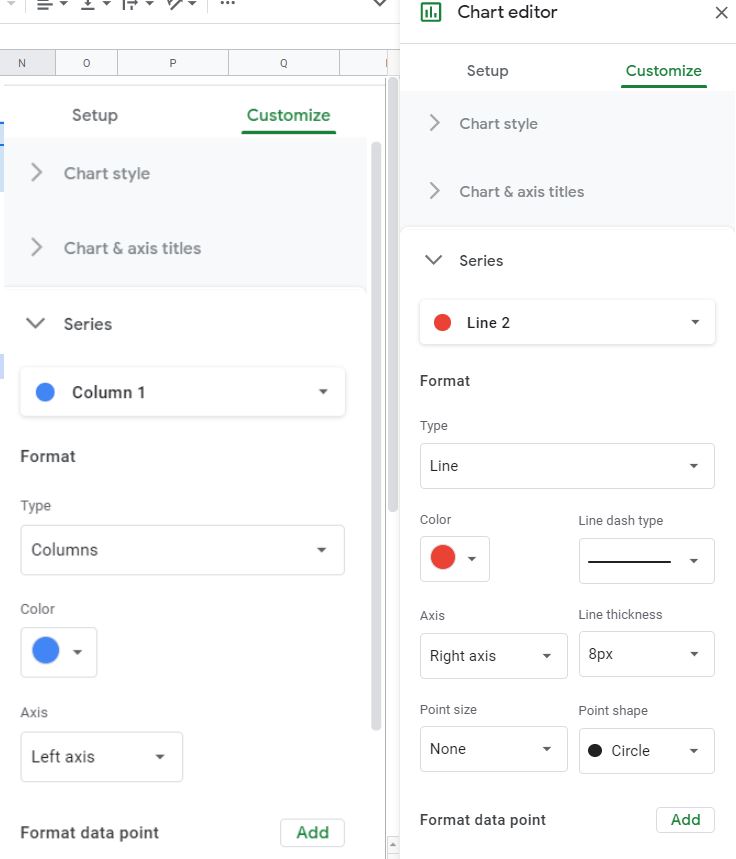
Then, change the Legend Position to “None.”
Add a Title like “Historical Dividend Amounts & Growth” and change the formatting to your personal taste.
When you’re done, you should have something like what’s pictured above. With the Dividend Amount represented by columns on the left axis and Dividend Growth represented by a line on the right axis.
That was complicated, I know. But a chart like this allows you to see absolute Dividend Amounts and Growth side-by-side. You’ll notice too, that the chart will change when you select a new Symbol (or Grand Total) from the dropdown in cell B4.
What can we learn from measuring Dividend Growth?
This worksheet was a beast. But, going forward you’ll have an idea of how fast or slow your dividends are growing.
Not that they’ll keep increasing at the same rate of growth. However, all things being equal, faster-growing dividends are better than slower-growing ones.
The faster they grow, the bigger your income relative to what you risked. And, therefore, the quicker you will break even and start locking in a profit on an investment.
Of course, you’ll have to size up the quality of management and the sales growth to qualify that dividend growth.
Now you have an amazing dividend tracking spreadsheet
This tool should be able to grow with your investments. Both as you accumulate more, and as the years pass.
It will require that you add new investments to the Investment Data worksheet. It will also require that you manually add dividend payments to the Dividend Data worksheet.
In a perfect world, this would all be automated. But, if your broker’s reporting was perfect, you wouldn’t need to build your own dividend tracking spreadsheet.
Hopefully, you’ll find this useful and even begin to add customizations you get more comfortable with it.
In closing, here are a couple of things to keep in mind as you use this tool in the future:
Don’t be afraid to double-check the pivot table with manual calculations. Obviously, you don’t have to do this for every piece of information. That would defeat the purpose of the spreadsheet. Rather, here and there, especially if something looks wrong.
If you’d rather use the investment Name, you can do that by adding it to Rows and deleting Symbols. You can also use Sym-Date, particularly if you have a lot of different lots of the same investment.
Furthermore, remember that you can narrow down the number of Symbols displayed by using Filters. Just (un)check the ones you do(n’t) want to see.
Finally, if you add new information and it doesn’t show up in the chart, double-click the chart to open the Chart editor. Make sure the X-axis and Series are capturing all of the cells that have the chartable information in them.
That’s it! This was a pretty big chore to create the spreadsheet and write the post. So, if I overlooked something, or if you have any questions – hit me up on Twitter.
Contents
- Save time – download a copy of the Dividend Spreadsheet here!
- How to make a dividend tracking spreadsheet template in Excel & Google Sheets
- Step 1 – Investment data
- Step 2 – Dividend data
- Step 3 – Previous year’s Dividends & Yields
- Step 4 – Total Dividends & Yield
- Step 5 – Dividend Growth
- Now you have an amazing dividend tracking spreadsheet